Baby Bindery

Contents

chapter one

Caveats

25 May 2015

https://thedesignoffice.github.io/babybindery/2015/05/25/caveats.html

Babybindery is still fragile in some spots.

Some things to avoid:

  • Complex embeds & iframes in your content.
  • Editing line-height. (this breaks polyfill regions’ ability to find the “bottom” of each region, so content spills everywhere).
  • Editing content margins or forcing page-breaks. Just embrace this funky web-ey look and use padding, please.

The connection between book.html and what actually prints out is tenuous; we suggest doing your best to make the book preview at book.html look as you’d like it, and we’ll do our best to make sure it prints like that.

If you have ideas on how we might be able to inject spreads into the book, cleanly and consistently… drop us a line.

Endnote Test

20 May 2015

https://thedesignoffice.github.io/babybindery/2015/05/20/endnote.html

This is an attempt to use the cite system.

The endnote which contains this text was right there!

demo

Curriculum Vitae

8 July 2017

https://thedesignoffice.github.io/babybindery/2017/07/08/cv.html

Contact

  • The Design Office, 204 Westiminster St, 3rd Floor, Providence, RI 02903
  • info@johncaserta.com; 401-305-

Education

2004 MFA in Graphic Design, Yale University School of Art
1995 BA in Journalism, University of North Carolina at Chapel Hill

Academic

Leadership

2014–16 Rhode Island School of Design, Department Head of Graphic Design
Highlights from 3-year term:
  • Researched, scripted and implemented new undergraduate core curriculum;
  • Initiated 1-credit workshop format;
  • Initiated and led renovations to graduate studio workspace and creation of exhibition/event space;
  • Staffed 110 courses/year; Added 15 new electives into curriculum;
  • Oversaw NASAD accreditation process for Department;
  • Supervised 3 staff members;
  • Oversaw hiring of three full-time faculty;
  • Garnered press and fostered substantial social media following

Faculty Appointments

2016– Rhode Island School of Design, Associate Professor
2012–16 Rhode Island School of Design, Assistant Professor
2006–12 Rhode Island School of Design, Critic
2011–12 University of Connecticut, Adjunct Faculty

Courses

Now The Web & Democracy, Web Programming, Design Studio, Advanced Typography
Recent HTML Output, Digital Bits, Call for Proposals, Graduate Typography
Past Serendipity in the Digital Library, Data-Driven Design, Graduate Studio 1, Visual Systems, Making Meaning, Relational Design

Committees

  Brown/RISD Dual Degree Oversight Committee, RISD Research Committee, Search Committees for Dept. of Furniture, Registrar, RISD Design Director
Sample text

Professional

The Design Office

2007– Founder and Director of a design-focused work and project space in downtown Providence
  • Co-working space housing 50+ independent practitioners since inception
  • Shared working library;
  • Post-graduate fellowship program;
  • Open-source software projects;
  • Public events and workshops;
  • Support for member projects & critiques;
  • Publisher & distributor of projects;
See website

Custom Flow Solutions

2009–12 Partner and Designer for company designing automated charts and graphs for media companies including Thomson Reuters and The New York Times

John Caserta Design

2005–12 Principal of a solo design practice focusing on information design for new media; Providence, R.I.
  Clients: Rockefeller Foundation, Antenna International, Creative Time, Max Protetch Gallery, Canary Project, American Battle Monuments Commission, Thomson Reuters, Watson Institute at Brown University, The New York Times, Macromedia/Adobe, Visa USA

Early career

2000–01 Quokka Sports, Creative Director
1996–99 Chicago Tribune, Design Director, Interactive News
1995–96 Atlanta Journal-Constitution, News Graphics Staff

Bibliography

Authored

2017 “Dear Class of 2017.” Design Observer, Read it.
2017 “Question the Classroom.” Design & Culture. Vol 4, #1 Abstract.
2016 “Kingdoms of God” with L. Widder. Manifest #2
2015 “Which 2016 Candidate Has the Worst Logo?” Politico Magazine
2015 “Thesis Book Project.” Design Observer
2015 Two browser-based images, Printed Web #3
2014 “Documentary Icons.” Icons and essay for The Noun Project
2014 “The iPhone is the new Model-T.” Essay for AIGA.org
2013 “Insights per Minute: On Obfuscation,” Design Observer
2012 “Can one size fit all?” The Noun Project blog
2010 “Instructions,” and “Khmer Rouge.” The Encyclopedia Project. Vol. 2, F–K
2010 Ira Rakatansky. with Lynnette Widder, eds. William Stout Publishers
2009 “It’s a Jungle Out There: What do Meat Labels Mean?” Meatpaper, Issue Six
2007 “Keys.” Tuesday: An Art Project. Issue 1:2
2007 “Pig slaughter, Montenero Val Cocchiara.” Meatpaper, Issue Zero
2004 “Black and White, then, Color.” Multi-purpose. Winterhouse Editions
1999 “Consistency vs. Variety.” Design. Vol 71
1999 “Online Newspapers.” Design. Vol 70

Cited

2017 Texas Standard. “New NBA Team Logo Spurs Critiques.” Michael Marks
2016 Eye on Design [AIGA]. “Design in 2016 Should’ve Been…” Madeleine Morley
2016 Eye on Design [AIGA]. “How Does RISD Teach Graphic Design…” Katie Chang
2016 ECT News Network. “Google’s New Fonts Chip Away at Written Language Barriers”
2016 Graphic Magazine. “Notices” and RISD GD part of alumni profile
2016 “Physical and digital spaces of daily interaction.” Interview with Jonathan Pierini
2016 Associated Press. “Designers weigh in on Rhode Island’s new logo?” Michelle Smith
2016 Providence Journal. “Local designers say logo gave wrong message” Mark Patinkin
2015 ThinkProgress. “Why Did The ‘Peace For Paris’ Image Go Viral?”
2015 Boston Globe. “A slow climb back for Providence” (The Design Office)
2015 Through Process. “Episode 25: Go Be Brave: With L. Hitchcock & J. Caserta”
2015 Quipsologies. “Modern Pictograms” website
2014 Box it up. “Letterboxes” Basheer Graphic Books, Singapore
2014 Deskmag. “Coworking in Providence, Rhode Island” Amanda Gray
2014 Providence Phoenix. “DesignWeekRI” Philip Eil
2014 Type Object. Barbara Brownie. Included “Spatial Typography” and “Letterboxes”
2014 Providence Phoenix. “Let’s work together” Philip Eil
2013 Bauwelt. Journal Issue 20.13 “Ira Rakatansky” book review
2012 Quipsologies. “Locally Made”
2013 Providence Phoenix. “Locally Made” Philip Eil
2013 Providence Phoenix. “What to do with the Superman building?” Philip Eil
2013 Pictos. “Modern Pictograms.” Index Books, Barcelona
2012 Downtown Providence. “Independent Design at 204 Westminster”
2012 The Next Web. “This new typeface was made just for interface designers”
2012 Quipsologies. “Modern Pictograms”
2012 Apartment Therapy. “The Design Office’s Vintage Modern Workspace”
2012 Rising in the East: Contemporary New Towns in Asia. Newtown Publishers
2011 Quipsologies. “Flatfile”
2011 Architect’s Newspaper. “Life Drawing”
2011 Quipsologies. “Fall Leaves”
2011 GoLocalProv. “The Design Office: RI’s Creative Collaborative”
2010 Apartment Therapy. “Rakatansky’s Mid-Century Modern Masterpiece”
2010 Architecture Research Quarterly. “Books Received”
2010 Apartment Therapy. “New Book, Ira Rakatansky”
2010 ReadyMade online. “As Modern As Tomorrow”
2010 3D Typography. Mark Batty Publisher. “Letterboxes”
2010 idN Magazine. Eco-Graphics Issue. “Letterboxes”
2010 Providence Journal. “Still Modern at 90”
2010 San Francisco Chronicle. “Providential Find”
2009 Apartment Therapy. “Letterboxes by The Design Office”
2009 Coudal Partners Blog. “Case Study: John Caserta”
2008 Providence Business News. “R.I. artist Recognized for Map of WWII invasion”
2008 Providence Business News. “Design Community is Growing in Ocean State”
2003 Digit. “Smart Art”
2002 Macromedia Showcase: Flash Interface Design. Macromedia Press
2002 eDesign. “XML in Flash”
2001 Communication Arts online. “Quokka Sports Network, Nothing But Net”
2001 Color Harmony for the Web. Rockport Publishers
1997 Redesigning Print for the Web. Hayden Books

Public Lectures / Panels / Juries

2017 Design × RI, 2017 Design Hall of Fame Award, juror
2016 Rhode Island Art & Design Film Festival, Interview with director of The Happy Film
2016 NCMPR (Comm College Marketing/PR) Dist. 1 Keynote: “Growing in all directions”
2016 Providence Public Library, D.B. Updike Prize, juror
2016 AIGA NY, “Designing the Future of Design Education” panel
2016 “Make it Yours” lecture with Design Office members, R.I. Commerce Corporation
2015,16 National Screening Committee, Design, Fulbright-Hays Program, U.S. Dept. of State
2015 AIGA Biannual Design Conference, “Browser to Book” lecture & panel
2015 University of Massachusetts at Dartmouth, lecture of recent work
2015 University of Delaware, Visiting Designers lecture
2015 RISD, “Artisan-Toolmaker” panel
2015 California College of the Arts, “Browser as Tool” lecture
2014 DesignWeekRI, “Organizational Systems” lecture and panel
2014 RISD Museum, “Critical Encounters: Design & Education” panel. Moderator
2013 Brown University Library Digital Scholarship Lecture Series, “Data-Driven Design Systems for the Web”
2013 AIGA Rhode Island, “Making of Modern Pictograms” lecture
2013 RISD “Intersection of Design and Manufacturing” panel
2013 RISD Museum, “Pedagogies Past/Present/Future” panel
2013 Michigan State University, “Visiting Scholars Lecture Series”
2012 RISD Research Colloquium, “Teaching Digital” lecture
2012 WordCamp Providence, “Wordpress for Teachers” lecture
2012 RISD Museum of Art, “Designers on Design” lecture
2012 Harvard GSD, “GSD Talks: Ira Rakatansky” panel
2011 A Better World by Design. Moderator, “Graphics that Inspire” panel
2011 Design Innovation Grant, RI State Council for the Arts. Judge
2011 Pecha Kucha, Providence. “Office Furniture”
2010 RISD Alumni Lecture Series with Ira Rakatansky
2010 Providence Preservation Society. “20th Century Buildings of Providence” panel
2010 Queens College, CUNY. “Vernacular Architecture of the Alto Molise”
2010 Pecha Kucha, Providence. “Favorite Photographs of Ira Rakatansky Buildings”
2005 Center for Documentary Studies at Duke University. “Works in Progress”
2004 The American Press Institute. Panelist, “Assessing Online Story Design”
2003 AltPick Awards. The Alternative Pick’s Awards for New Media Design. Judge
2002–04 SNDies. Society for News Design’s monthly and annual competition. Judge
2001,02 University of North Carolina at Chapel Hill. Speaker, “Multimedia Bootcamp”
1999 University of California, Berkeley. Panelist, “Online Journalism”
1998 The Poynter Institute. Speaker, “Visual Edge” photography conference
1997,98 Society for News Design’s annual conference. Speaker and panelist
1997 AIGA Biannual Design Conference. “The Future of News” lecture & panel
1994–97 NPPA Electronic Photojournalism Workshop

more

On Mary Beth Meehan

15 May 2017

https://thedesignoffice.github.io/babybindery/2017/05/15/marybethintro.html

Hello, I’m John Caserta, founder and director of The Design Office. I want to welcome all of you here… particularly newcomers. Bathroom and fire exits? The Office is coming up upon 10 years, and has for the past five has hosted events that foster meaningful conversation and mingling amongst designers and related fields. One topic of interest here has been the city of Providence, itself. I was pleased to see Mary Beth’s work become part of the city – at city scale – uncommon – quite a different experience than seeing photography in snapchat or instagram. The series captures the best of our fellow citizens and places them high up for all to see.

Lynne McCormack, former Director of the City of Providence Department of Art, Culture + Tourism writes, “our goal in working with Mary Beth on this project was to set the table for a conversation about race that comes from a place of dignity and grace.”

The intention tonight is to host a conversation about the project with the photography community. This is why I asked peers of Mary Beth to lead the discussion … Thad Russell and Jo Sittenfeld … both teach photography at RISD, and both have been active practitioners and photographic citizens here in Providence. As moderators, they have questions and the interest to guide the discussion.

Dear Class of 2017

3 May 2017

https://thedesignoffice.github.io/babybindery/2017/05/03/graduation.html

Dear graduating class,

Congratulations, class of 2017. After three or four years studying Graphic Design, is it clearer what it is, and how it can be put to use? Just because you’re getting a degree in Graphic Design doesn’t mean you’re required to be a graphic designer - or that you have to do it for the rest of your life. There may be a time when you stop payment on your Creative Cloud subscription, and put away your laptop altogether. What I love about a graphic design education is that you can put your degree to work anywhere you like. What better way to apply your degree than to broaden our understanding of what it’s good for.

Michael Rock, known for an essay titled “Designer as Author”, uses the phrase to argue that the design is part of the message. How it looks, how it’s seen, how it’s made, etc all contribute to the ‘content’. This message of empowerment is often misunderstood (as Rock himself wrote) to mean that designers are most valuable when they generate their own content. But the misreading led to another two decades of other “designer as…” idioms, many by luminaries in the field. If you are questioning whether a career in graphic design is for you, the below list of hypothetical uses for your Graphic Design degree is for you - it may come in handy as you consider how to bridge your design education to the possible futures. It may also help remind you all the ways that a design education prepares students to take action beyond the obvious.

  • Designer as producer
  • Designer as editor
  • Designer as printer
  • Designer as forgerer

1-inch Buttons, 50¢

12 April 2017

https://thedesignoffice.github.io/babybindery/2017/04/12/buttons.html

Members and friends of The Design Office designed 1-inch buttons — for sale in a gumball-style machine for 50¢ each. Designs range from left-leaning political commentary, to visual aphorisms and typographic pleasantries. Members were emailed and asked to design a button in less than two days. The prompt was the following: “A button is seen up close and on your person (or bag). How can you engage another human? How do you show you’re part of ‘a tribe’?

The Button machine

The buttons were designed in response to AIGA RI’s “See Us” call for submissions. The exhibition, held in the RISD GD Commons, made for an ideal site for a self-service device. We ordered Busy Beaver’s Button-o-Matic machine and placed the object within the show. Each buttons costs 50¢, the cost of each button (at the quantities ordered). The machine is currently site at New Harvest Coffee in downtown Providence.

Created with Sketch.

Credits

Designs were contributed by Design OFfice members and collaborators: Lucinda Hitchcock, Michelle Bowers, John Caserta, Kristin Silva, Jay Marol, Sarah Rainwater, Benjamin Shaykin and Cyrus Highsmith. The Button-o-Matic is sold by Busy Beaver, Inc in Chicago. 50¢ vinyl symbol designed by John Caserta and cut by Graphic Innovations in Warwick.

Hindsight

31 March 2017

https://thedesignoffice.github.io/babybindery/2017/03/31/election.html

We gain a lot in hindsight — it’s an opportunity to reflect upon a previous best effort; to understand your own self better. Michael Beirut just wrote an essay reflecting on the Hillary Clinton campaign identity. This prompted me to dig up what I sent Politico in response to their request for reactions to the candidate’s logo.

My angle at the time was about “voice”. How can a logo draw out the essence of a candidate? This seems so incredibly naive as I read it today. Trump is now our president and the GOP runs congress because of acts of coercion and lies. A successful identity is the one that helps the candidate win. What will convince someone to belief the rhetoric, the fascade of the candidate? How does a political campaign need to be any less convincing than any other piece of marketing. There is a promise made, a suggestion. It does not need to be fulfilled.

Clinton’s graphic identity was incredibly contemporary, incredibly well executed. But it did not win. Would there have been a graphic identity that would have helped Clinton win? Does design matter?

Here’s my original text:

Campaign Logo Roundup

So many candidates, so many logos, so many problems. It doesn’t matter what the candidate believes in, there is a greater need to check “the logo” off the grand list of “to-dos” when getting a candidacy started. Moreso than bad typography or a lack of finesse, the great disappointment in the presidential candidate’s logo is a lack of voice. Most of them simply “belong” to a hoohum lineage of campaign logos. It’s borderline mandatory to use red, blue and to drop a star or arrow into the candidate’s name itself.

Successful logos should bring out the personality of the person as much as his/her political ideology. So much of this happens in the typeface alone. Jeb and Bernie appropriately use their first names typeset in informal, approachable serif fonts. The bubbly exclamation point in Jeb Bush’s logo makes him seem goofy, but maybe he is. Trump’s typeface could be more Trump Toweresque. It’s a pretty uninteresting sans-serif font. It’s good to see the website add a shiny gradient. That way we understand that the candidacy follows up from the person himself.

Hillary’s logo uses political colors and a touch of the election ballot arrow. But it is too diagrammatic to offer some sense of the woman. The logo reads as this: “take this blue rectangle on the left and move it to the right of this other rectangle. Then we’ll be done.” Or as one of my female colleagues at The Design Office said, “I want to like it, and I would like to like to like her, but I don’t like either.” And although the Clinton logo is one of the least emotive and least evocative of the person or the ideology, it does give itself an opportunity to take on meaning as the race evolves.

The Web & Democracy

22 March 2017

https://thedesignoffice.github.io/babybindery/2017/03/22/webdem.html

Is the Internet making the world a better place or is it simply remaking the world – peacefully transferring capital from 20th century corporations to 21st century ones? If the digital space is becoming primary, then who is tending to the systems of self-government, defined so articulately in the age of Enlightenment?

This Web research elective asks students to design tools that further the public’s interest online. Can the Web – designed as an open and free medium – reinvigorate our investment in public space and the public good? Students will work together to engage politicians, non-profits, and fellow citizens in the pursuit of these questions.

Assignments will range from Web tools that serve democracy to civic fundraising to information dissemination. Class deliverables will be a combination of prototypes, presentations and coded mini-sites. Students will develop the parameters for the final project and work in teams. Outside collaborators and readings will enrich the conversation and the work. No previous web experience required, but Web Programming workshop strongly encouraged.

Learning Objectives

  • To put the Web in service of the common good instead of the marketplace
  • To learn about people’s views and wants for government
  • To design web tools for all audiences
  • To adapt private ventures into public ones

Ongoing

Shared platforms

Code demos

Weekly demos, activities held at 8am for one hour. Look at various ways to build mini-sites, etc.

  • US Web Standards framework (download and use it)
  • Framework 2
  • Jekyll, Markdown, Github, etc
  • Flex and Grid
  • Mobile, needs of mobile

Schedule

Day 1: Intro to course

Syllabus overview

Who are we?

  • Introduce ourselves
  • Activity: Ask students to identify what groups they are a part of, and then, how do those groups organize themselves

What is democracy and how might the web influence it?

Brief lecture
  • Democracy defined.
  • Plato on why we form society
  • Failures, possibilities, alternative models.
  • The Web today versus its idealistic state
  • How does a government differ from a private company? (Terms of service?)
Creation of class pact
  • How might the class structure itself support, reinforce or play with the central ideas of the course. Do we form a constitution? How much of what we do is public/online?

Readings

Unit x: Information dissemination

How are participants in an organization informed about key decisions, proposed changes to that organization? There are significant portions of the population who sit at the margins of any democratic process – particularly when it comes time to voting, voicing support or opposition to civic and state matters, etc. African-Americans, immigrants, the poor do not always benefit from democratic ideals and processes. How might the Web reach these people? How might it acknowledge their perspectives, needs, etc.

Readings/Reference

  • Socrates on an informed public as necessary to a functioning democracy
  • How can design help people learn (CooperHewitt show)

Assignments/Activities

  • Activity: Design a voter information guide using Web Standards framework
  • In-class activity: Split into groups of three and perform an audit of a corporation’s communication strategy (each person chooses a similar company in a certain sector to deduce best practices/norms: tech, non-profit, government, small private). What is appealing to users vs shareholders vs media? How do those writing styles differ? Debrief with each other.
  • Assignment: Part One: Perform user research. What do “people” know? What is available for them to know? What might need to be generated? Design a tool/site/system (notifications, etc) that would reach a certain sector of a community. Perform 5 interviews from a certain sector to better understand that sector (geographical community, demographic, etc). You need not be limited to governmental constituents, but also potentially organizational constituents.
  • Part Two: Design a vehicle to best communicate with your constituents. Certainly useful for city council meetings, GD Dept. meetings, etc. May also be interesting to connect it to how one voted (the actions of people). Megan Kallman’s email newsletter. Qualitative language. Meeting minutes verbatim vs summarized. Role of councilperson vs media (work of RIfuture.org).
  • How do you encourage someone to act. What fits the current lifestyle? “Busyness” vs disconnected.

Guests

  • Ryan Laughlin on tools that handle public data

Unit x: The voting machine

Asking user input is a critical part of a design process. It’s also central to democracy. Voting machines as evolving technologies, with each machine introducing its own mechanical and human flaws. Take the butterfly ballot that cost Al Gore the 2000 Presidential election, as an example. The goal, is it not, is to capture one’s intentions and be able to verify that intention. The screen will no doubt have a future in voting. Let’s look at the simple act of voting through the lens of the screen.

Mark Zuckerburg, Harvard 2017 commencement address

Reference / Readings

  • A look at previous voting machines
  • Look at more current technologies and hear about debacles: LA touch screen, IDEO, etc (John Marion, Rob Rock)
  • Voter Guides, state of voting design (Dan Chisnell)
  • Where is the Public Today essay (CooperHewitt). Porto Alegre’s participatory budgets

Assignments/Activities

  • Activity: Look at javascript/jquery needed to design touchscreen
  • Assignment: How does voting engage its constituents? How specific should questions be framed to get desired outcomes?. Do voters remember their choices? Create an “election” for one of the constituencies that you belong to (a project, dorm, GD, RISD, etc). What are you trying to know? How should people vote? What are your goals for turnout? Include aspects of representative democracy (vote for a person or a proxy) and direct democracy (voting on issue where the outcome determined by majority).

Guests

  • Danny Chapman on accessibility and frameworks

Readings/Reference

  • Black Mirror episode with voting
  • Dana Chisnell Handbook of Usability Testing

Unit x: Garnering participation

How are resources gathered to take on the work of the common good? Can the Web, a “fast” medium (low effort, high volume), lead to “slower” more meaningful interactions/investments from constituents? In other words, how might the Web get someoff off their screen and put their body alongside of others? Can the Web encourage participation from communities that tend to not participate in governance? Does capitalism also mandate that wealth equals success?

Readings/Reference

  • NYC Street Trees
  • AIGA/NY Hurricane Sandy Design/Relief
  • Code for America
  • Change by Us (Local Projects), See Vimeo
  • Civil Debate Wall (Local Projects)
  • Hangout with opposite viewpoint
  • Archon Fung, Harvard, Participedia
  • Public libraries / resource sharing

Guests

  • Megan Kallman and/or Nirva LaFortune newsletter (blog?). Qualitative language. Meeting minutes verbatim vs summarized. Role of councilperson vs media (work of RIfuture.org).

Assignments/Activities

  • Design a tool that engenders participation from a community (is there value associated with it?)

Unit x: Public debate (do we know each other?)

140 characters plus the like button have destroyed debate on the Internet. Early blogging played up comments in a way that they were publishing. How do we of differing opinions discuss now? How do you change someone’s mind? Can the Web facilitate this discussion, perhaps make the face-to-face discussion more palatable when it does happen.

Readings/Reference

  • Rousseau and General Will (GW as an abstraction of sorts,)
  • We live in Public (all connected all the time)
  • Zuckerman Atlantic article

Guests

  • Ethan Zuckerman on MIT news aggregator

Assignments / Activities

  • Activity: Union of Concerned Scientists. Fact vs Fiction
  • Activity/Short assignment: Go to a City Council meeting and try to make sense of it for those who weren’t there. Choose a platform/location for the content to appear. Co-opt or hijack a commercial tool for public use. How does the tool allow for follow-up conversation, feedback?
Case Studies/ ideas
  • Union of Concerned Scientists - convince of scientific fact
  • Wikipedia revisions
  • Digital Hangout with opposite viewpoint

Unit X: Open Assignment

Hone in on three to four projects. Discuss/vote and work in teams to accomplish. The project should address the basic question: how can the web ameliorate democracy: to inform people, to encourage elevated discussion, participation… all the issues we’ve discussed over the semester.

What does collaboration look like?

22 March 2017

https://thedesignoffice.github.io/babybindery/2017/03/22/intersections.html

What does collaboration look like? Having run The Design Office — a collaborative of designers — for 10 years, I have been keeping a list of ways that designers can work together — since the term gets thrown around as something that is either easy to achieve or necessary.

I’d like to stage photographic sequences for each of the collaborative models. Probably would take place in an abstracted white room setting… but perhaps also at The Design Office big table. Images would be inspired by 1970s matter-of-fact how-to imagery … but using contemporary tools and dress.

Collaborative models

  • Back and forth: Limited number of participants (2 ideally), with everyone shaping it in an ongoing and iterative way. One person working, then passing to next.
  • Crowd-sourced: One person asks, people in other places satisfy that ask. Best result(s) used.
  • Active hand-off: One person designs, then hands to the next person
  • Passive hand-off: One person designs, leaves the design, another person chooses to pick it up.
  • Parallel play: All doing same task alongside each other. Pick from results or combine results
  • Perpendicular play: All doing different projects alongside each other. Ideas rub off.
  • Group share: One larger task is done by multiple people at the same time in the same space.
  • Group split: One larger task is broken up into smaller tasks then recombined or synthesized. Larger task may be known (have been planned out) or unknown (needs to be discovered)

Animated Pictograms

22 March 2017

https://thedesignoffice.github.io/babybindery/2017/03/22/Modern-Pictographs.html

Embed code

Mumford in the 21st Century

10 March 2017

https://thedesignoffice.github.io/babybindery/2017/03/10/ncsu.html

the world of technics itself must be transformed: salvation lies, not in the pragmatic adaptation of the human personality to the machine, but in the readaptation of the machine, itself a product of life’s needs for order and organization, to the human personality. — page 14 of Art & Technics

Former New Yorker architecture critic Lewis Mumford gave a series of lectures in the early 1950s titled Art & Technics. His thesis should be clear from the quote above – the eloquence of his argument itself a testament to his humanist’s beliefs. His criticism remains prescient, even if the specifics have changed. I would like you to read the chapter (lecture) from the volume that covers the history of printing as a way to understand mechanization’s relationship to handwork. It is called “From Handicraft to Machine Art” and starts on page 59 of this pdf.

The chapter, I believe, is appropriate for graphic designers today, who find themselves buoyed by platforms of technology a layer above printing. The 21st century designer must broker the needs of the machine — or system of machines. But on what value system are these platforms built? That of the machine (efficiency, predictability, etc) or of the person (in an idealized state, perhaps)? What is defining our profession that we don’t even get to question?

When in Venice, California recently, I feasted on the latest works of great architects – the Broad, in particular. Contrast these rare feats with the humdrum of new residential buildings, which could be described as UX Modernism — highly predictable, quickly produced and made as palatable to all involved. I discovered that many of the homes were made by leaders of the tech sector nearby in Silicon Beach. Are the factors that create generic contemporary buildings not dissimilar from the factors that make for generic user interface design? Is custom, hand-made design, impossible to manage on a large scale? What is the role of the machines (codebases, templates, rate of change, etc) in how we design? Is the history of Graphic Design no one of the history of machines – a profession defined by its departure from manual lettering?

During my visit to your class, I would like to show you how I’ve attempted to hold onto humanist values in my own work. Following this show and tell, I’d like to discuss how Mumford’s lecture applies to your work in school and beyond (if it does). Where do human values play into design? How do they come in conflict with the values of machines — and, now, automation? Are you excited about the role of machines in your work?

Type and Material Workshop

1 March 2017

https://thedesignoffice.github.io/babybindery/2017/03/01/materials.html

The shape of letters is dependent on tools and materials. Materials are involved in two ways: the material used to inscribe letterforms, and the material into which the letters are inscribed. Letters are made by something and exist on something (or in it). The history of typography shadows the history of printing presses and papermaking. But given the boon in digital fabrication options, letterforms themselves are finding new shapes. Whether on plastic, styrofoam, wood, vinyl, metal or made by hand, letters can look like almost anything if you let them.

Artist Shannon Ebner works with cement blocks.

I will show digital and physical examples (figures 1-4) of typography made with various tools and materials. Attendees should bring their laptops in order to fabricate their own letterforms in the Brown Design Workshop. Some materials will be on hand, but attendees are encouraged to bring their own.

Index of works

I have started a Type & Materials collection on arena. Anyone is welcome to add to this open collection of bookmarks. Each block (bookmark) is tagged with a material or tool below.

  • bike chain
  • brick
  • building projection
  • caution tape
  • cement
  • clay
  • computation
  • desks
  • dots
  • earth
  • everyday objects
  • fabric
  • fence
  • flag
  • flowers
  • food
  • furniture
  • granite
  • hair
  • hands
  • hot dogs
  • LED
  • lego
  • letters
  • light
  • lips
  • light
  • light bulb
  • marble
  • meat
  • metal
  • milk crates
  • neon
  • newsprint
  • organic
  • people
  • perforation
  • plastic
  • powder
  • router
  • rubber stamps
  • scissors
  • sheets
  • stencil
  • stairs
  • sticks
  • stone
  • styrofoam
  • sword
  • tape
  • thread
  • traffic light
  • water
  • wax
  • weave
  • wire

Let’s make something

In the time remaining, design and fabricate the word “we”. Pick a machine and a material (clean or used) first, then make a design based on your choice. How can you push the conventional shapes of the letters based on the material, the machine and your own desire to stay something. Instagram pix of your final images with a mention of “@designofficepvd” and hashtag “we-made-type”

Question the Classroom

4 February 2017

https://thedesignoffice.github.io/babybindery/2017/02/04/essay.html

Abstract:

This article encourages instructors to redesign the classroom. Finding the balance between service to students and to one’s own work has become increasingly difficult for professors. A recent overhaul of the BFA program in the Graphic Design Department at The Rhode Island School of Design has created an opportunity for faculty to bring in their own areas of interest into the classroom. The results so far have been more interpersonal connection, more diverse outcomes to projects, and an agile core curriculum. See the full essay

Towards a web teaching philosophy

3 February 2017

https://thedesignoffice.github.io/babybindery/2017/02/03/webphilosophy.html

Towards a web teaching philosophy (in progress)

How do you teach someone to design for the web? Is the web that different than other screen-based formats (phone/tablet apps, pdfs, software).

The design process relies on fiddling, adjusting, coming across by intention or accident something that stops the maker. There is a pause, some sort of analysis, an adjustment. If the designer’s scope of work is limited to the 2D aesthetic space, then there is more design left to be done by someone else. And are those humans at odds? Teaching someone to design for the web must get into how sites are engineered, even if falling short of students engineering the sites.

The website is networked by definition, even before the browser is refreshed.Michaelson quote about playing with an engine as it’s running. There needs to be enough code knowledge to play with interactive designs. Maybe not construct from scratch, but to hack it.

Any medium is an opportunity to reinforce values, to see those play out in other ways. Life expressed in a new species. The web may look like paper at times, and it may look like video at times, but it is neither. Designers should be a part of nurturing the medium towards self-actualization (a trajectory, not a destination). The teaching here is one of values: to design for others, to not be fearful of expressing the content at hand in a unique way. If your heroes had the web, what would they have made. How can humanity push through to people on the other side, without losing either person on each end.

Good interaction design can be built upon good print design. It can be learned in parallel, too. But ‘classic’ skills such as hierarchy, legibility, etc. are needed on the web. And they are not simple to learn. Don’t teach them as tidy quick rules (serifs are for this, and this much drop-shadow looks right). Try to take on the complexity in your words, if not the curriculum. Don’t talk about typography at all, maybe. Let that exist somewhere else.

Letter to the Editor

24 January 2017

https://thedesignoffice.github.io/babybindery/2017/01/24/wsj-letter.html

The purpose of an education is to see through the conjecture and implausible techno-fantasies penned in David Gelernter’s recent op-ed piece, A High-Tech Rebirth From Higher Ed’s Ruins, Jan 23, 2017. Would it to be too much for Gelernter to mention an institution, a course, or a faculty member to substantiate his characterization of college as a catastrophic failure with ‘slanted readings and random garbage’?

His portrait of a dying industry could not be further from my experience in higher education. Colleges are dense ecosystems of learning and research that have propelled decades of innovation. Students learn from faculty, from each other, from the vast resources at hand, and by being at arms length from the marketplace. Colleges are vital centers for thought that ask students to form opinions and put themselves into the debate. There are facts to be learned, yes, but there are many ways to interpret and make use of those facts. To be educated is to have knowledge to draw from today, but it also engenders the capacity to learn in perpetuity.

Underlying Gelernter’s networked future is a belief that education exists to serve the marketplace. Education falters if it is not valued as a good onto itself. What catastrophe awaits our society if we dismantle higher education in favor of limited certificate training with ‘software templates’ from think tanks, churches and biotech companies. The marketplace teaches only what the marketplace needs. As artificial intelligence improves, a hands-on education steeped in arts and humanities will become more important, not less. There is proof that college functions, just ask the many educated leaders in our workforce today.

-30-

Design Studio 1

22 September 2016

https://thedesignoffice.github.io/babybindery/2016/09/22/syllabus.html

  • Rhode Island School of Design Graphic Design
  • GRAPH-3210 req Fall 2016
  • Tuesdays, 1:10 – 6:10pm

Graphic design occupies an ever-expanding, ever-redefined territory at the intersection of verbal and visual languages. Its media spans everything from websites to postcards, film to signage, typefaces to billboards. Its methods make use of both sides of the brain: pairing logic, critical analysis, research, and planning with intuitive search, mark-making and visual expression. Graphic designers are inquirers, observers, poets, editors, curators, analysts, researchers, commentators, and critics.

Rather than attempt to codify this expansive landscape, or to delineate a sequential path through it, this course takes this ambiguity as license for experimentation, discovery, and play. You will encounter and engage the tools, materials, and processes of graphic design in functional context, as means to self-directed ends.

The emphasis will be on methodologies of making — observation, analysis, ideation, translation, curation, research — and on developing a personal voice and approach.

Design Studio will take the form of a series of question-based units, each initiated by a faculty member and contextualized by a presentation, event, or workshop. Units may span the entire term, a few weeks, or a single class period. Design Studio is a fast-paced course that necessitates a self-directed, open-ended, experimental and playful mindset. Units will not define outcomes or prescribe processes, but rather will aim to inspire lines of enquiry, challenging students to explore unfamiliar subject matter, tools, media, and processes by their own initiative.

Overview

DS1 pushes students into a variety of directions, introducing critical tools, methods and content areas in the field. DS1 assumes no prior knowledge of tools or skills, but is not designed as ‘introductory’. Finished projects are not the intended outcome of DS1.

Units

flag

Unit 01: Keetra Dean Dixon

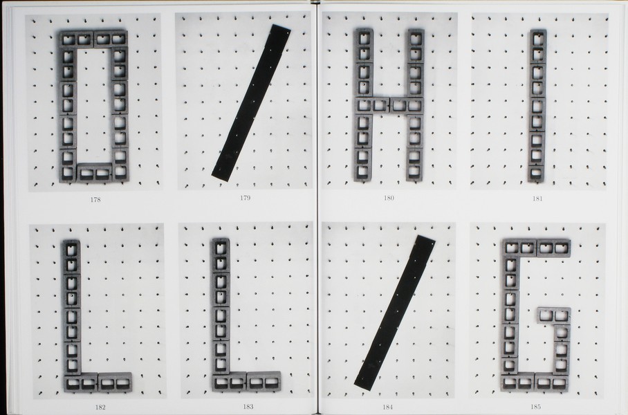
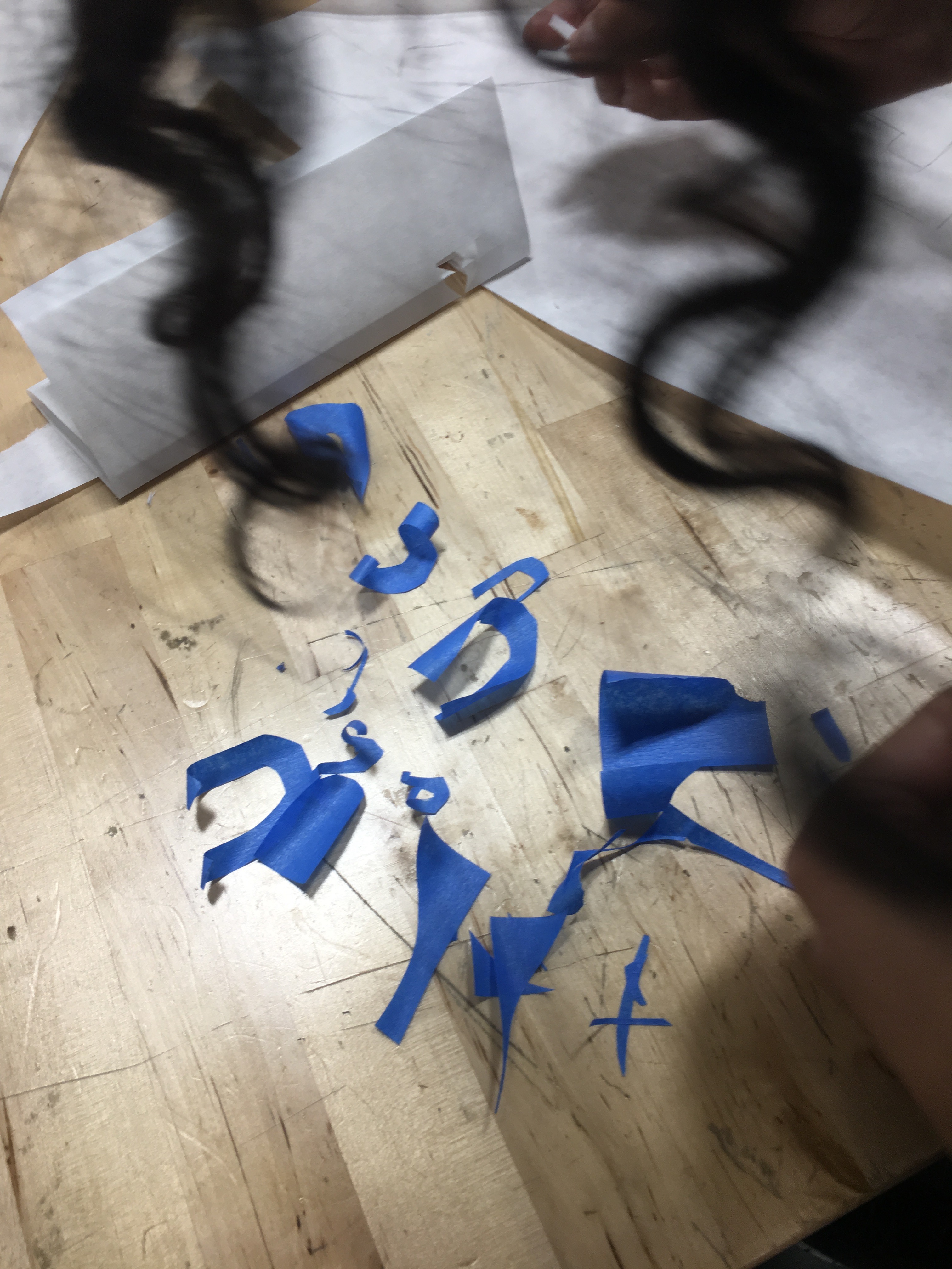
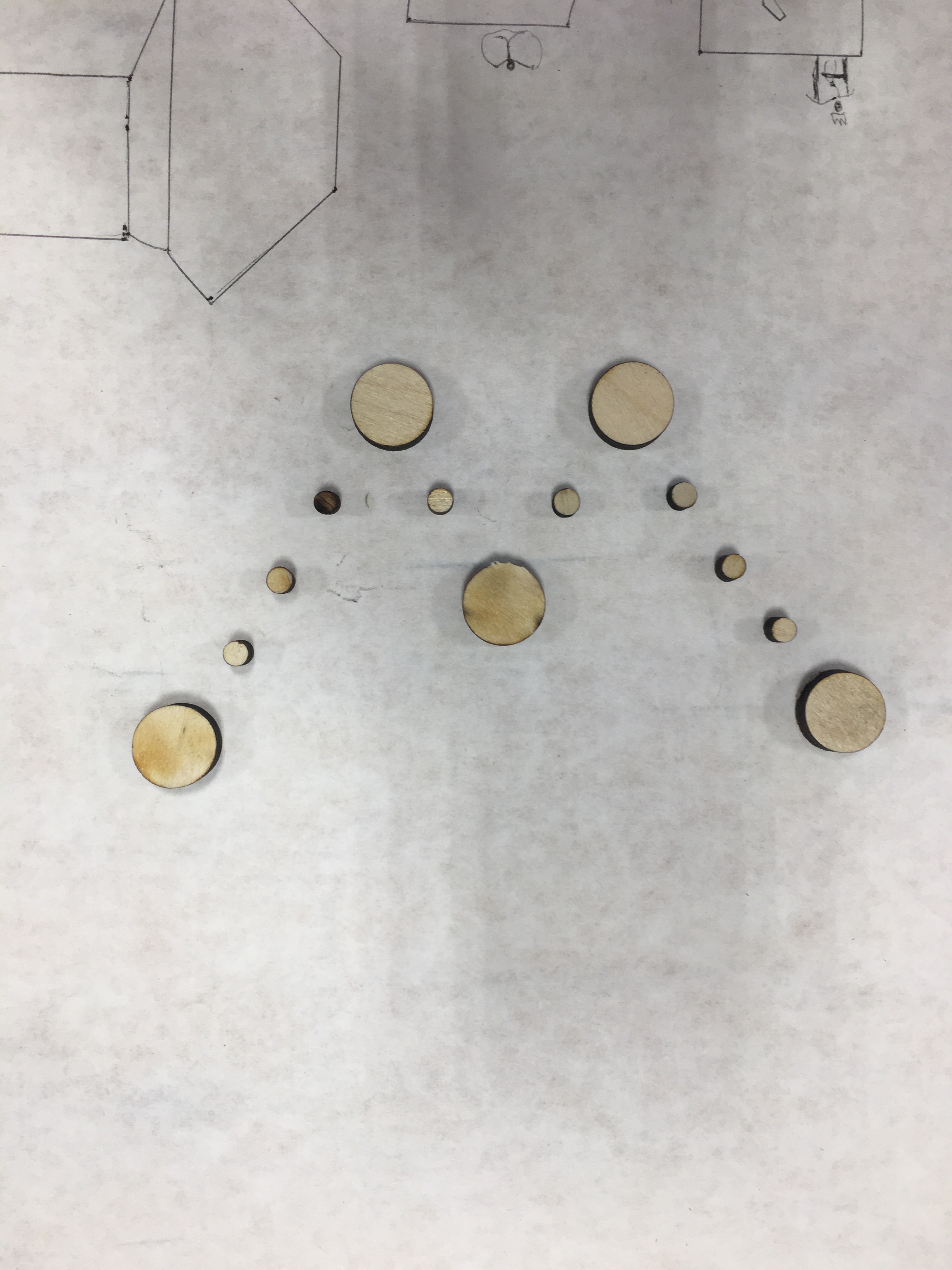
How can you translate what you see into a graphic language?

In 1919 Kandinsky wrote an essay in which he used the metaphor of verbal “language” to discuss the laws of visual form, calling simple geometric shapes “forms belonging to the first sphere of graphic language.” He came up with the full metaphor of “visual language” not long after and it has since become a foundational concept in the study of graphic design.

In this unit, we’ll use the basic structures of language to lead an interpretive deconstruction of our surroundings, transforming them into a distinct graphic language. Just as paragraphs can be broken into words and words can be broken into letters, we’ll break photos of our environment into their basic formal elementals. We’ll translate those elements into new forms, exploring a variety of materials and tools as we go. Your collection of forms will then be used to create new compositions, a graphic language all your own.

Unit 02: Tom Ockerse

How can the graphic medium enhance, enrich and deepen the verbal message?

In engaging with the world around us, and our routine to “make sense” out of complexity, we take for granted the perceptual and holistic principles this interaction involves. That perception of parts and configurations as a holistic system depends greatly on the use of so-called “gestalt” principles (i.e., figure-ground, similarity, closure, etc.) and how these serve the purpose to communicate. Since graphic design presents ideas primarily via graphic means, awareness of these perceptual principles is critical for designers to help their products stimulate clarity and unity, curiosity and interest, inquiry and insight. We will look into this power of graphic design to discover how an abstract (non-visual) object like a “word” (i.e., a verbal means to represent an idea) can be enriched significantly toward a deep sense of poetic insight due to its combined graphic/visual delivery, and thus provide a lasting impression of value for the ideas it holds.

flag

Unit 03 John Caserta

How can we use symbols to unify a group?

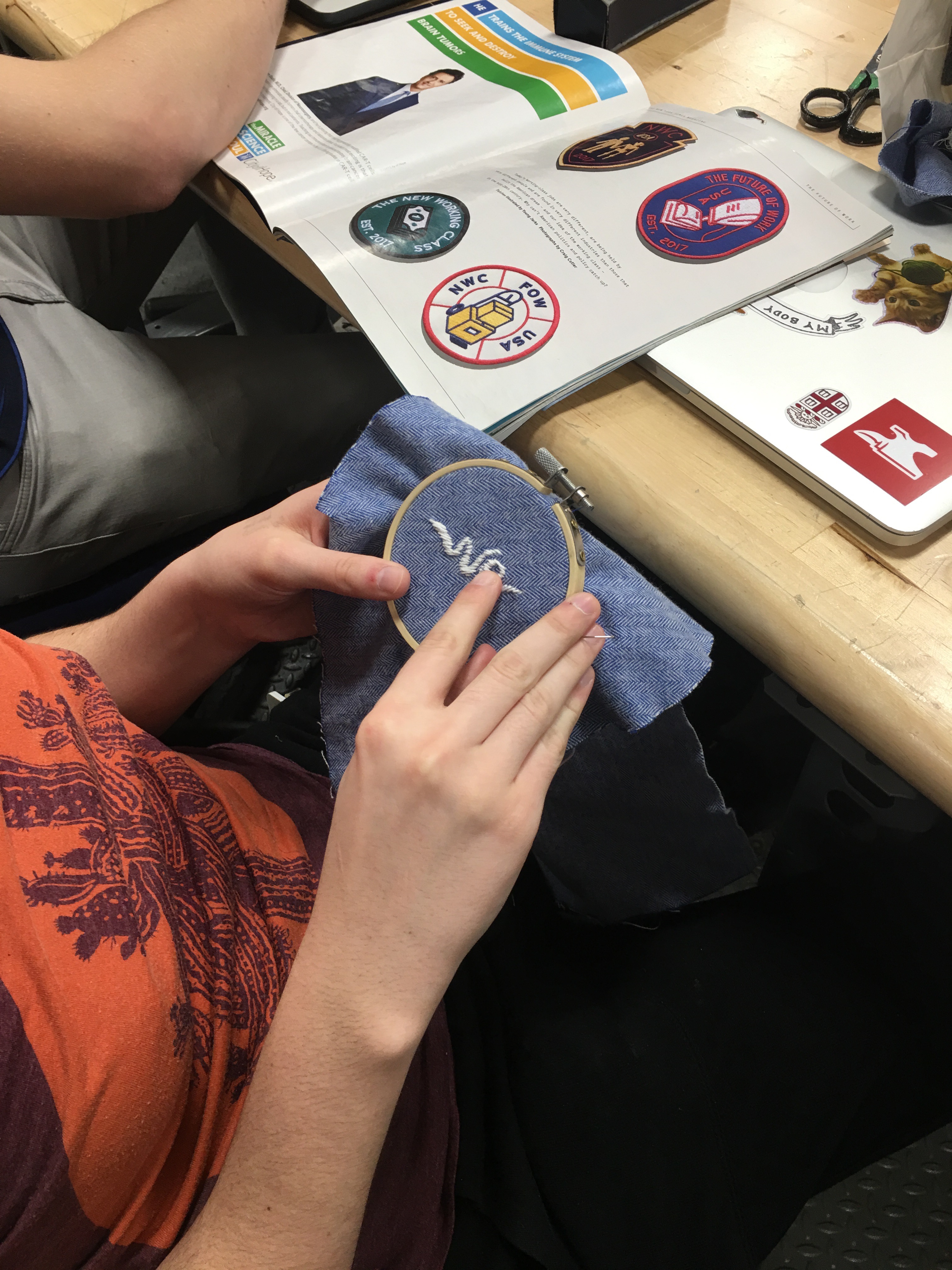
The creation and appropriation of symbols to create meaning is an important part of a designer’s toolset – whether on a flag, website, emblem, logo or other context. This unit will take a close look at flags as an example of how symbols can connect (or distance) a group of people. Whether for nations, towns, labor unions, or schools, flags make use of simple forms to communicate cultural, historical or aspirational qualities of the group. This unit asks students to perform basic ethnographic research to better understand the values of a group, and to design symbols — sited on flags – that communicate those values.

Unit 04 Thomas Wedell

How does the sequencing of information affect communication?

One of the main concepts necessary to understanding the design process is the use of time. Careful ordering and distribution of information is essential to successful communication.

In the expanded world of graphic design, time plays a major role. Not only in how we engage in the design of an exhibit or screen based project, but also in the considerations a designer must build into two-dimensional “fixed” surfaces, such as signs, books, posters, and charts.

The graphic designer today must learn to master the art of pacing. How a viewer encounters information in a specific sequence and the pace at which that information is viewed, is one of the basic elements of communication. The order in which ideas are accessed is at the essence of any design project.

Unit 05 James Goggin

Does design imply the idea of products that are necessarily useful?

In 1969, the French curator Yolande Amic posed this very question to designer Charles Eames. His reply? “Yes, even though the use might be very subtle.” The unit will question divisions and overlaps between beauty and utility, and between art and design. What makes something useful? What kind of use is deemed valid in design? Should design solve problems, eliminate labour, and/or aid in the creation of capital? Can a design that simply makes us laugh be considered “useful”?

We will conduct experiments and make proposals, aiming to challenge thinking about utility and beauty, and subvert conventions of common tools, formats, systems, and objects. With the overview we are often afforded as connectors between — and participants in — authorship and production, graphic designers have the power to challenge expectations and provide utility in unexpected but entirely appropriate, even delightful, ways.

What is BabyBindery?

31 May 2015

https://thedesignoffice.github.io/babybindery/2015/05/31/what-is-babybindery.html

With John Caserta (JC), Catherine Leigh Schmidt (CLS), Lukas WinklerPrins (LW).

JC: Hey guys… back when you took HTML Output with me we made a chunk of javascript, Bindery, that prepared a set of web-native content to be printed, directly out of the browser, with some printing parameters.

CLS: That was cool.

LW: Yeah. It was a book generated in the browser.

JC: I want you two to work on updating this…

CLS: Make it more extensible and easy to use? Evan Brooks was the only one who really knew all the details.

LW: He was the maestro.

JC: Yeah, something like that. I want to be able to use this thing, to print out a blog, or a museum catalogue, or an interview project, or who knows what.

CLS: We can do that, for sure. The gist is, if you have a bunch of templated web content—like blog posts, or the catalogue for a museum show— which gets pumped through Jekyll to make your site, we want it to be easy to hit cmd-P and have a good-looking book!

LW: I think what we should do is keep the idea of Bindery.js, but scrap the spaghetti code we wrote as a class and get a clean slate. Make a little version.

CLS: A baby bindery.

JC: Sounds good. Babybindery can build a responsive book. Design your content for the web, then print. It handles the rest.

LW: As long as you’re using Jekyll.

What Babybindery Does

30 May 2015

https://thedesignoffice.github.io/babybindery/2015/05/30/what-it-does.html

Babybindery takes a set of categorized post content in Jekyll and turns it into a printable book, the styling of which is easily editable.

Babybindery is a collection of HTML layouts, includes, CSS files, and JS files that are designed to live in a Jekyll repository. The content should be in _posts.

We have print.html and print_twocol.html layouts that use Fremy CSS Regions Polyfill to pour the information (from book.html) in your Jekyll Posts collection into a book.

If you’re confident with CSS and know something about Liquid and Jekyll, it is simple to extend Babybindery’s capabilities, or trim it down to the bare essentials. We have done our best to apply minimal and extensible styling, so changes stay tidy. (We only recommend not touching the line-height.)

How Do I Install It?

29 May 2015

https://thedesignoffice.github.io/babybindery/2015/05/29/how-to-install.html

  1. First, embrace Jekyll as your static-site generator.
  2. Then, clone the babybindery repo and set it up in your directory of choice for local development. (Install Jekyll if you haven’t.)
  3. Decide what your content categories should be. We have started you off with “image,” “conversation,” “text,” and “other” (the last of which can really be a catchall). If you want to change these, please see the guide for “How Do I Change The Content Types?”.
  4. Hop into the css directory and make changes to your body, headings, headers, footers, and so forth. Careful though! Please look at the “Caveats” document for a couple warnings.
  5. Write your posts by working in the _posts directory. Make sure to check the posts we’ve provided to get a sense of the front matter you need to write. Then feel free to remove what we included.
  6. Once ready to publish, push to a gh-pages branch or do whatever necessary for your github pages to get working.

The Book Structure

28 May 2015

https://thedesignoffice.github.io/babybindery/2015/05/28/book-structure.html

While the webpage structures are mutable to your needs, the print.html and layouts is special.

In it, a fixed number of pages are generated (you can change this number by editing _config.yml). There’s a lot of nesting to keep track of details, and this is the list from outside in: .sheet, .page, .content-wrapper, then either one or two .page-content (which can help facilitate a two-column layout), then .content divs that have content flowed into them.

All of the content comes from book.html.

How Content Flows

27 May 2015

https://thedesignoffice.github.io/babybindery/2015/05/27/content-flow.html

  1. Raw content (in html, txt, md, etc filetypes) turns into a site, generated by Jekyll.
  2. On the book page of babybindery, all of the site content is dropped into one DOM element, with the CSS property ‘flow-into: flow-name’.
  3. CSS Regions Polyfill takes all of the content in this DOM element into the flow, and then hides the element.
  4. The content from the flow is poured through a series of content areas with CSS property ‘flow-from: flow-name’. We have these content areas inset in .page objects, so that each fills a typical content container on a printed page.

How Do I Change The Content Types?

26 May 2015

https://thedesignoffice.github.io/babybindery/2015/05/26/editing-categories.html

We anticipated three content types: “Conversations” (a generalized interview), “Images” (appropriate for show catalogues or portfolios), and “Text” (catchall text-based content). There’s also “Other” on by default.

If you seek to shrink or expand this list, start in _config.yml and simply edit the variable content-types. If you want a multi-word content type, please wrap it in quotes in _config.yml, but don’t wrap it in quotes in your post files.

Reminder: you must rebuild if you make a change to _config.yml to see the changes appear.

And as a final point: layouts and content-types do not need to be one and the same!

Squid in red pepper sauce

25 March 2015

https://thedesignoffice.github.io/babybindery/2015/03/25/squid.html

This was something I put together one day for an appetizer, to go with fresh bread. Squid is in regular supply all year round at the farmer’s market, and although fresh tomatoes are nice, canned peeled tomatoes work really well, too.

Ingredients

2–4 cloves of garlic
2 red peppers
28oz can of whole peeled tomatoes
1lb Squid
6-8oz Olive oil
  • 2-4 cloves of garlic
  • 2 red peppers
  • 1 28oz can of whole peeled tomatoes or equivalent fresh peeled tomatoes. Put fresh tomatoes in water, boil and remove to remove peel easily
  • 1 pound of squid. You may clean yourself, but if cleaned, even better. But make sure you have the natural mix of tentacles and tubes
  • 6-8oz olive oil

Instructions

Put the olive oil in a cast iron dutch oven pot on medium heat. Smash garlic cloves to peel and place in olive oil. Take care that they don’t burn.

Add loosely chopped red peppers. No need to peel them. I cut them so that the pepper pieces are about half a finger length and about half an inch wide. Don’t dice them, you want them to be a part of the personality of the dish and should be on par with the squid in terms of size

Sautee the peppers until they’re soft. About 15 minutes. They shouldn’t burn or lose their peels. Otherwise the oil is too hot.

Cut the body of the squid into tubes or cut down them vertically to open them up and let them be pepper-sized pieces. The tentacles can be cut coarsely.

Add squid and tomatoes to pepper, olive oil and garlic mixture. Simmer for at least an hour. Water should be bubbling off, but it shouldn’t get too dry. The squid will become rubbery after a minute, and after about an hour become soft again. 1.5 to 2 hours can be a good total length. Lower heat if it’s drying out.

Great as a pasta sauce, but ideal served in a small bowl with bread to dip into it – or eaten with a small spoon.

Page intentionally left blank.

Index of URLs

Page intentionally left blank.
1
2
3
4
5
6
7
8
9
10
11
12
13
14
15
16
17
18
19
20
21
22
23
24
25
26
27
28
29
30
31
32
33
34
35
36
37
38
39
40
41
42
43
44
45
46
47
48
49
50
51
52
53
54
55
56
57
58
59
60
61
62
63
64
65
66
67
68
69
70
71
72
73
74
75
76
77
78
79
80
81
82
83
84
85
86
87
88
89
90
91
92
93
94
95
96
97
98
99
100